skip to main |
skip to sidebar


1.‘We rather trust in ice storms than snowguns’Season's greetings card, 2008, 148 x 210 mm 2.‘I rather trust in crafts than marketing’Poster, 2008, silkscreen, 905 x 1280 mmmore moire here.

speaks for itself.
Cute article I stumbled upon while at work. Although at least 4 of those I did learn while at school. My teachers couldn't stress BACK UP YOUR WORK enough, seriously. ⌘S is engraved in my brain forever. I do need an external hard drive though, keeping my stuff on DVD is a little nerve wrecking, not gunna lie.
click here to read the article.Here's my #11: double check, triple check, and then check again. No matter how many times you think your client has sent you the correct text, half the time, they don't proof half the shit they write. So remember to check spelling over, and over and over again. Nothing will kill you more than having a finished product in your hands and then realizing you spelt something out worng. Anyhoot, hope this is useful in one way or another.


Sorry it's been a while since my last update! So much is going on in my personal life, that I have unfortunately fallen behind on my design blog. All for good reason though, I'm working on my website, which I will definitely be sharing with all of you as soon as it is up!
On another note,
i am so utterly in love with black and white photography. I also really love how 3D they've made this look using perspective on the type.
someone, anyone, be cool enough to accept work like this in Montreal.

A prime example, that simplicity works best. I've yet to understand why people are obsessed with cluttered/screaming design. With all the overly designed shit there is, wouldn't you want something of the opposite nature to help make your services/product stand out?
This poster is for against child sexual abuse based in Germany (Please click on the image to see it in full-size, definitely has more an impact that way). It's clean, simple and sure as hell gave me goosebumps when I first laid my eyes on it. uh-mmazing.
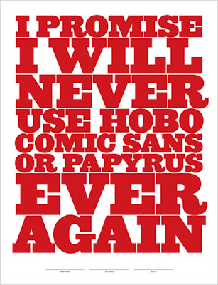
 I am so thankful someone finally thought of making this. Please, Pledge.


I have a
 great appreciation and fascination with things flying/floating in photography. I've found a couple of photos that I really enjoy due to the dramatic, vulnerable and intense sense it provokes. These are all random pictures with the same theme I've found via ffffound, but are not by the same photographer.
 A friend of mine so kindly sent me a link to 40 Excellent Logos created with Helvetica.
Check it out, You'd be surprised as to how many of these you see on an EVERYDAY basis. Knoll(and has been for a long time), AmericanApparel, and Tupperware are my faves.
What are yours?


